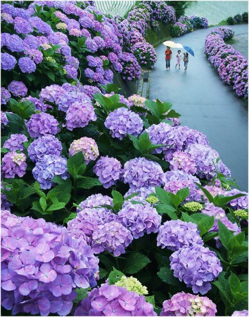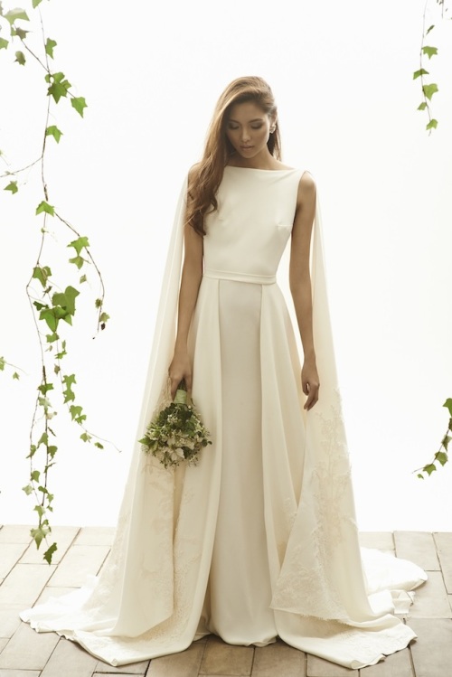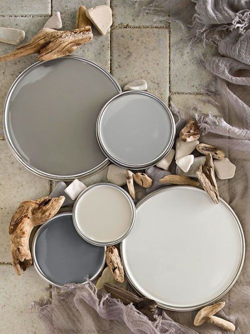

This month, we have been super inspired by the colours spotted on Pinterest as we start to plan our next collection. With the new year approaching, there is an increased fascination with springtime colours paired with longstanding neutrals.
A colour palette that has been on our minds recently and will most likely be the next subject of our Hot Hue series are the shades between coral and pastel pink. So soft and gorgeous!
Here are our favourite pins from our Pinterest boards this month that have been inspiring our work. Click directly on the images to go straight to the pins and their source!

Min: I would love for this to be my future living room. I adore the printed tiles and window so so so much 😀

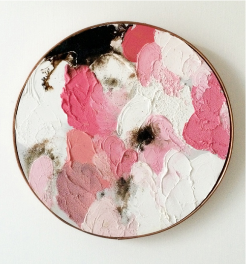
Min: Minimalist. Clean lines. Colours. What’s there not to like about this Esther Steward painting? The colour combination is bold yet soothing. I can’t wait to incorporate these colours into our future work!